Rebranding Australia's premier accounting brand.
Over the years Chartered Accountants had gone from a leading accountancy body to a bunch of disparate and inconsistent brands. Our task was to bring the myriad of separate organisations together under one, recognisable brand that worked across the myriad of their different divisions.
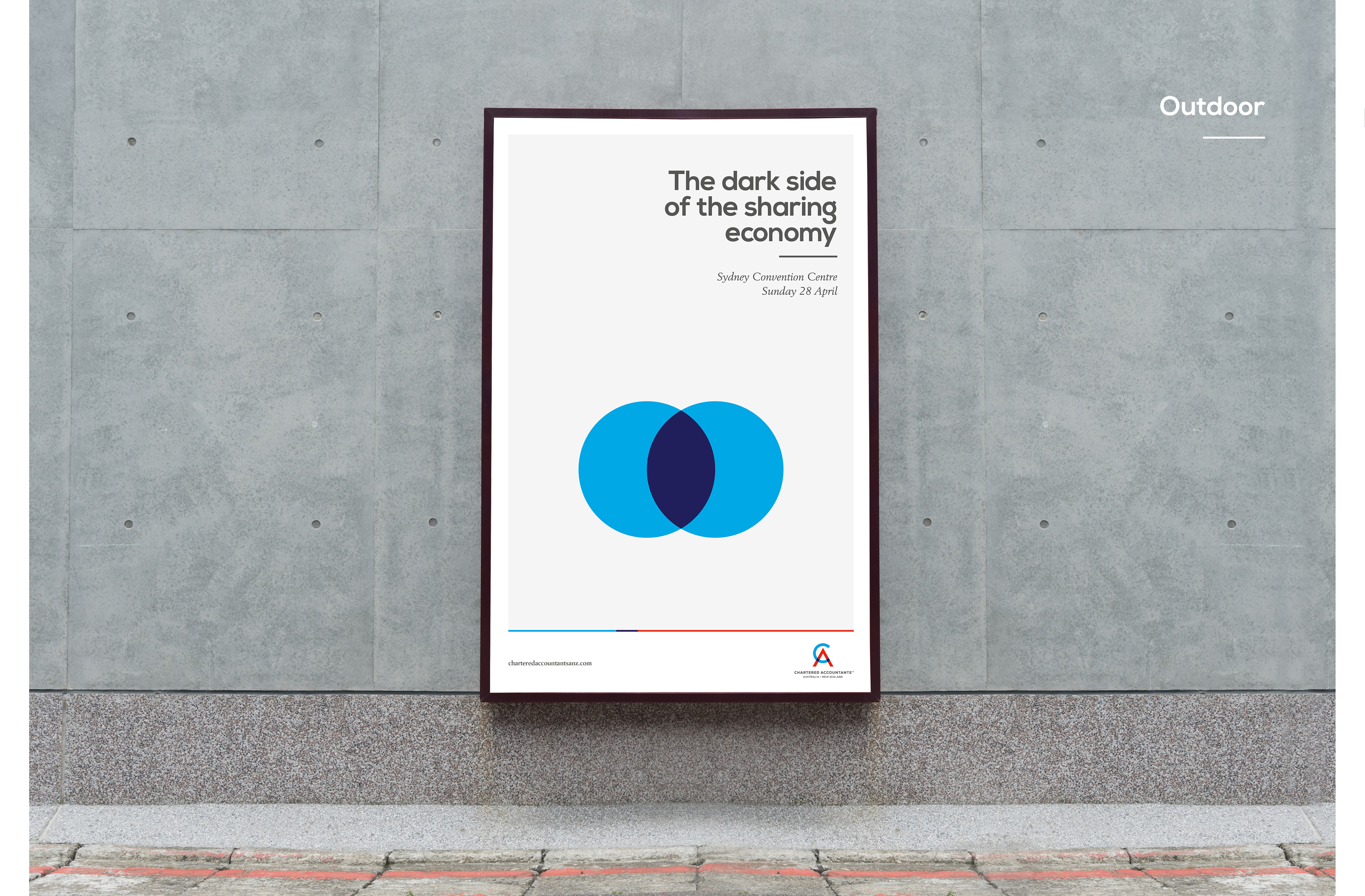
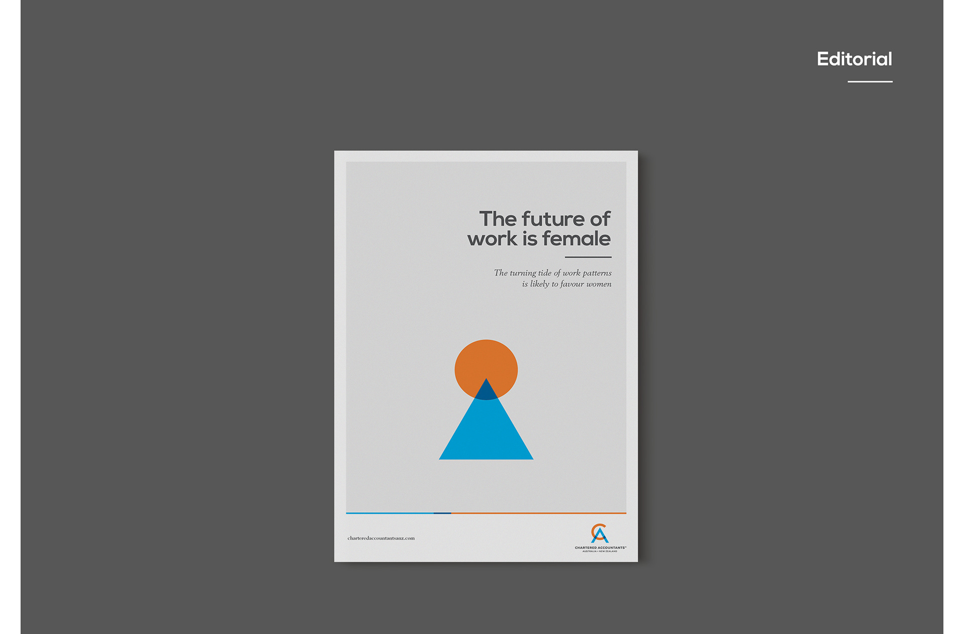
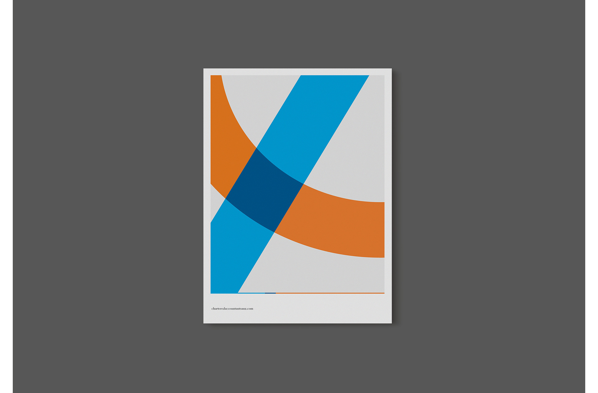
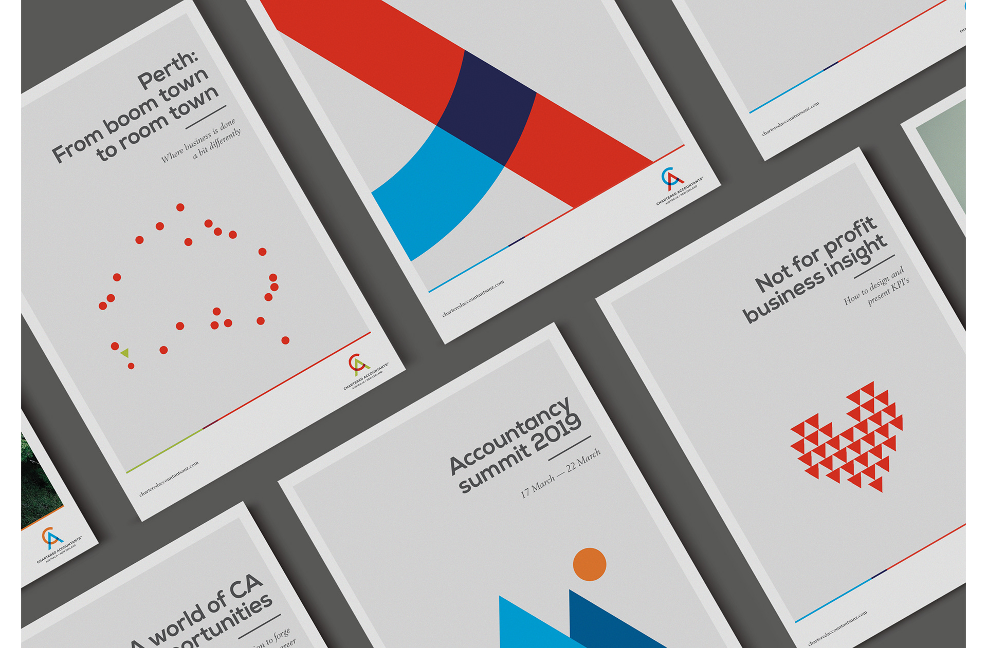
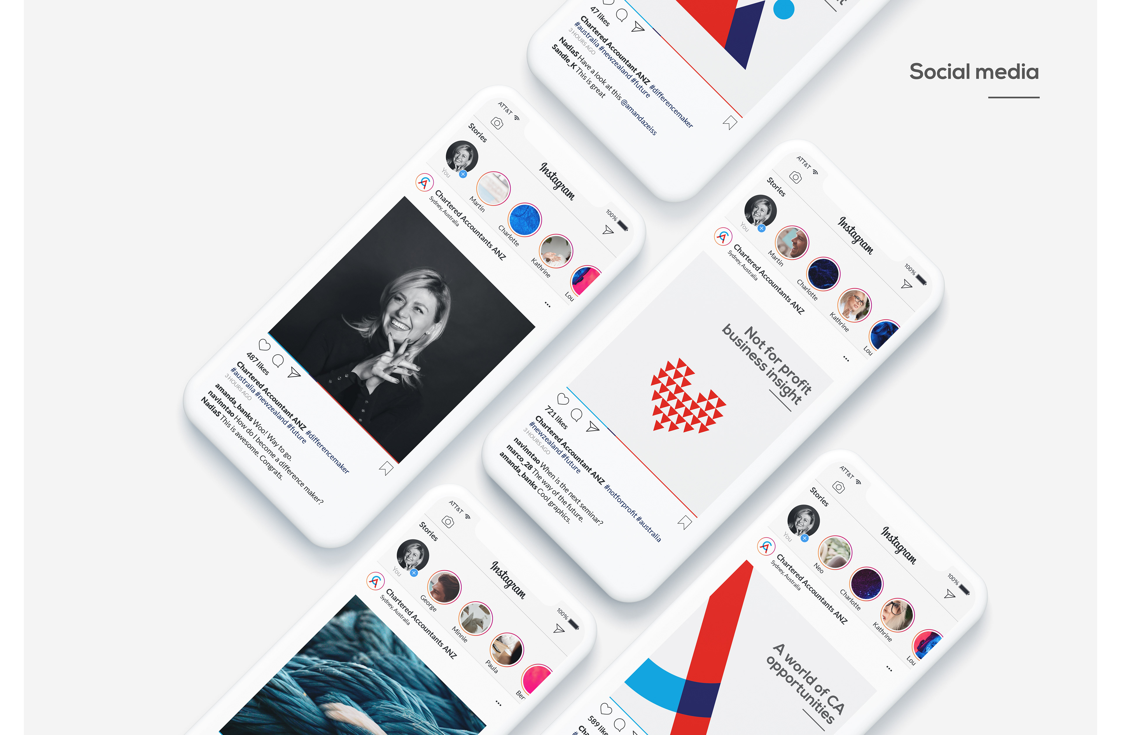
We started with two shapes derived from the logo – the circle and the triangle – and created a visual system that could work across any medium with any message.
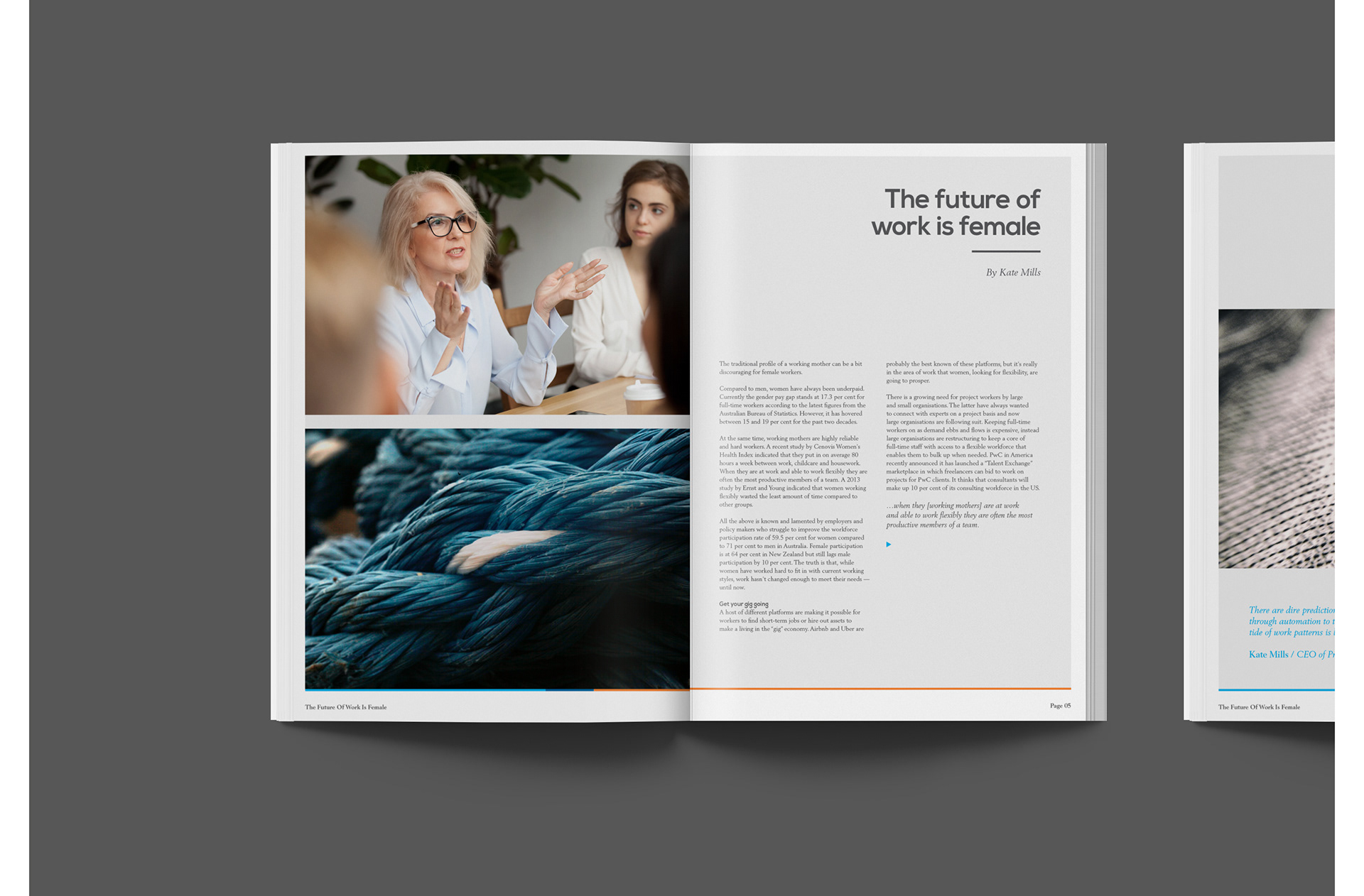
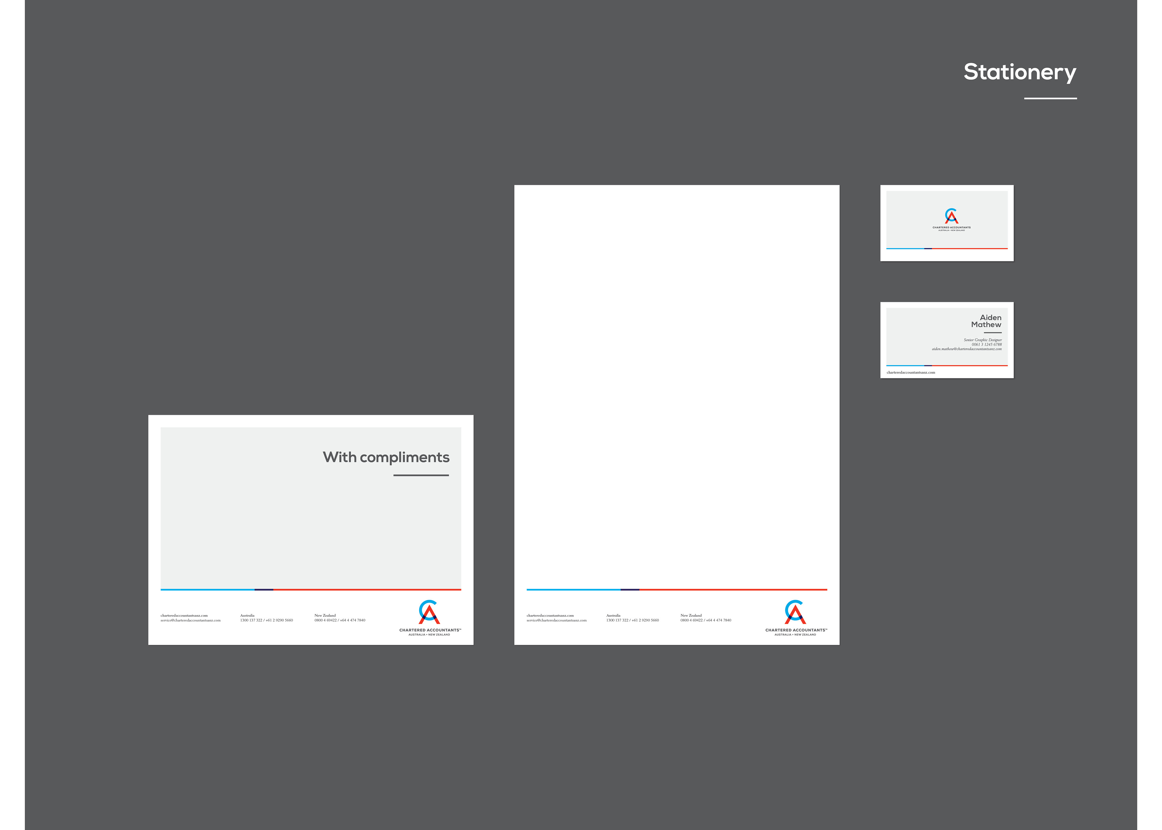
Our visual framework was derived from a format that any accountant would be familiar with – a ledger. We subtly brought to life a Chartered Accountant’s obsession with numbers using right-aligned headlines and underlines.